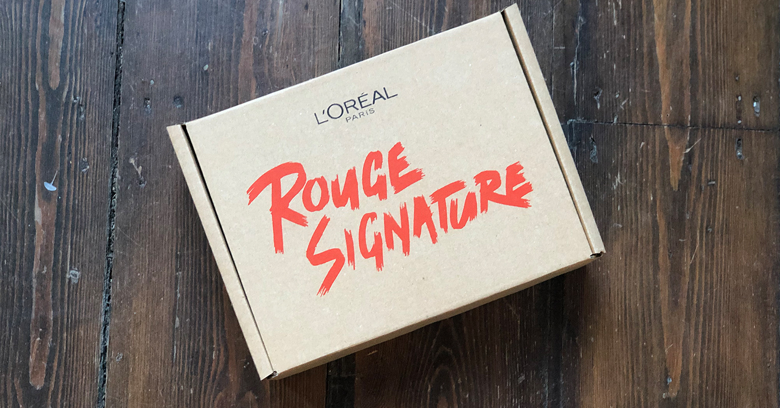
Fonts are one of the most important parts of bespoke packaging – so what does your logo and font used on your packaging say about your brand?
To start off, you need to choose a font that is both relevant and appropriate for your area of business. If you run a small niche business, you may want a font style that represents your laid back attitude, whereas if you have a large corporation you may opt for a simple and bold font.
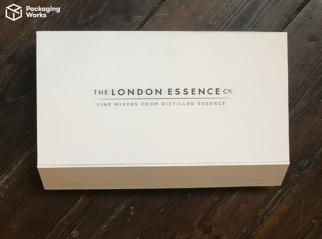


Packaging font size
The size of font is also important.
If you have a ‘fancy’ style of font such as script, it will likely need to be a bigger size so that people who may not know your brand can easily read it.
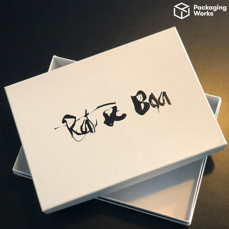


Be wary of fonts that are too big or too small! Huge fonts could distract people from the product inside of your bespoke packaging yet you want to ensure customers are able to read it clearly.
You can try out our online box designer tool to see how big your logo needs to be on your desired size of box, or contact our design team for advice!
Font colours on packaging
The colour of your font can also be a make or break for your product packaging. Choose a colour that ensures people can easily read what’s written on your bespoke packaging.
Design tip: yellow is the most eye-catching colour!



Let the font do the talking.
This is totally possible with our bespoke packaging! Choose a mix of fonts placed strategically on the box to make a statement.
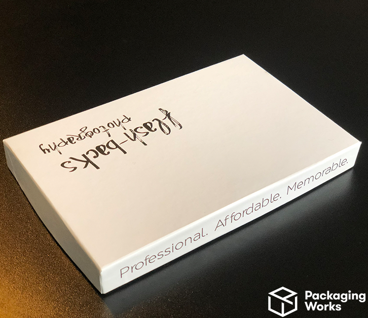


By using bold font and colours, you can make an amazing design on your personalised packaging.
For businesses that are very high-end, you will most likely see the font placed in the very centre of the packaging. However, with our bespoke boxes, you have the freedom to place your font anywhere you feel represents you!
Feeling ready to get creative and design your own bespoke packaging? Drop us a line to discuss your next project!
Back to Blog