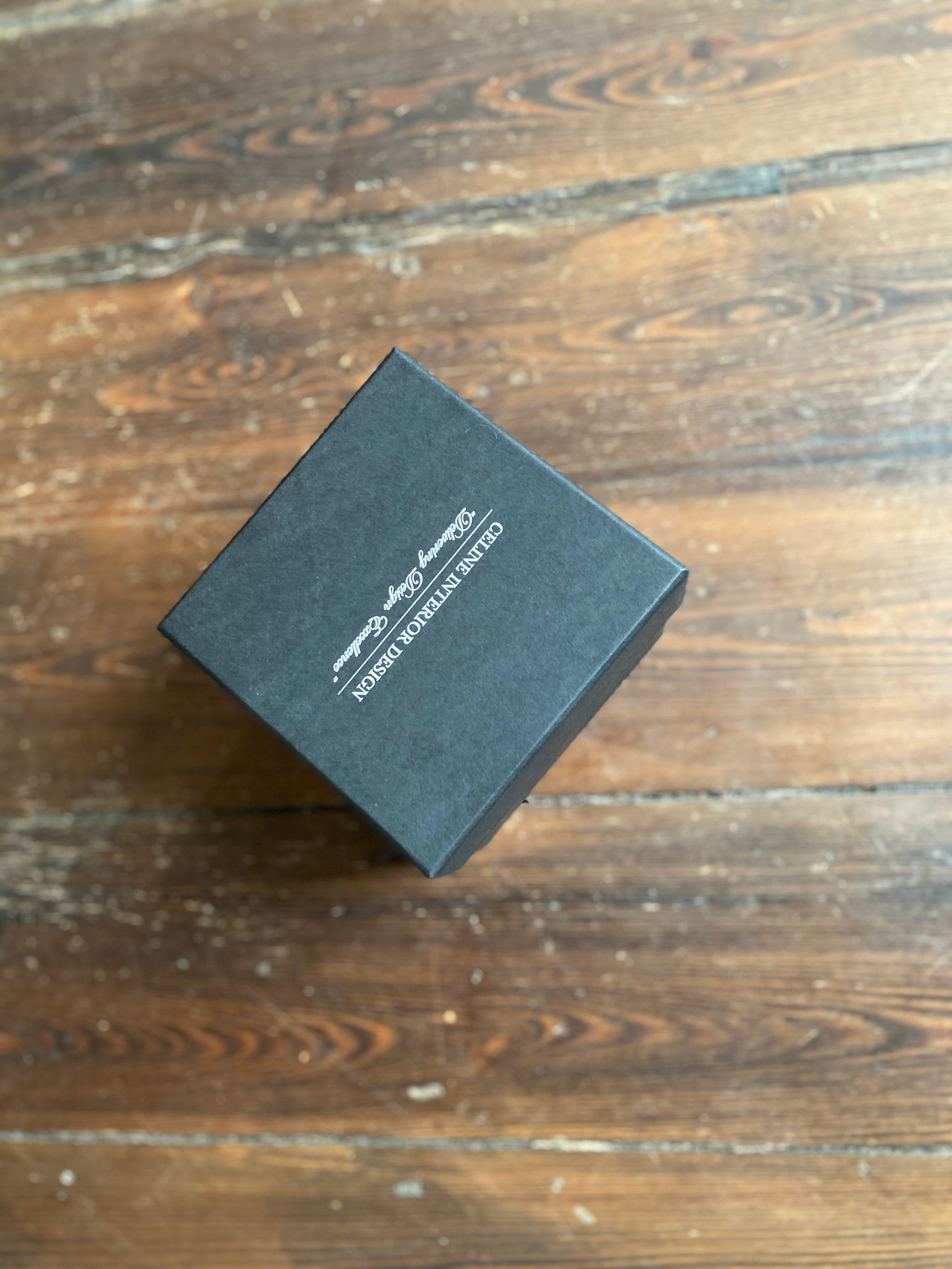
Your packaging does not always have to be loud and colourful, whilst we love when bold packaging stands out to a consumer – we also love it when something simpler hits the spot.
One of the most important parts of packaging is the colour and the message this portrays. Whilst you may think a simple black box is boring, black emulates feelings of luxury and exclusivity. If you’re still unsure, here are some designs to inspire you:
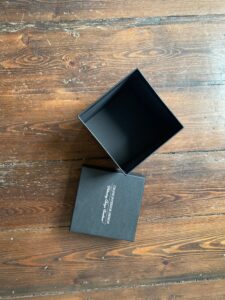


It’s easy to worry about what colour font will look good on a black box, but there’s loads of options from foil printing to a classic black and white print. This Celine Interior Design opted for a white font, which adds a richness to the box.



Accessorising a black box is much easier than brighter colours. For example, look at this luxury Schweppes box, complimented by the matching black fabric interior and insert.
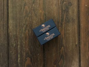


Most black boxes feature gold and silver foil printing but ‘cop a feel’ of this Singleton Glen Ord packaging. Instead of gold and silver, they chose copper matching their logo.


Jaguar didn’t want foil printing they wanted something more discreet yet poignant. The popular feline logo is engraved onto the box and only shows in certain lighting – mysterious!
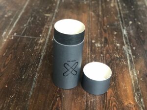


What about going slightly ‘off black’, this steel grey box has all the characteristics of a black box but with a contemporary feel. Did we mention that boxes do not have to be square?
We can help you create boxes of all shapes and sizes, one of the most popular is a tube, just like this one but if you’re imagining something crazier, let us help make your packaging dreams a reality!
If you have some ideas for your new packaging or would like to request a quote for bespoke boxes, please feel free to contact us with your questions.
Back to Blog