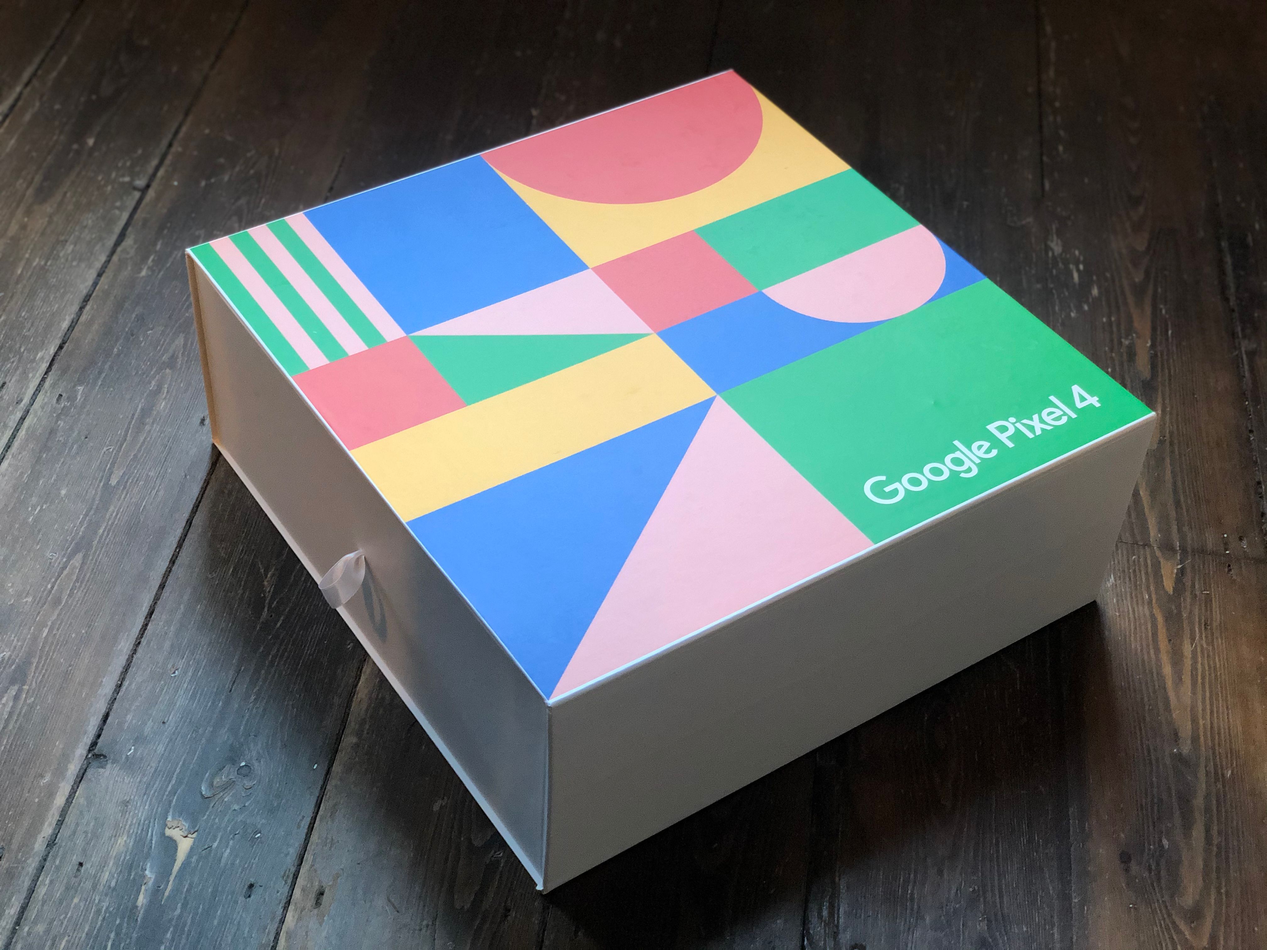
It’s an age-old concept that successful packaging design should be ‘in your face’ and grab your attention with bold patterns and loud colours… yet there’s also a flip side to packaging which also strikes a chord with consumers.
Minimalist packaging is simple, elegant, and suggestive of luxury whereas maximalism offers bright, funky patterns that tend to be more seasonal. Regardless of your choice, minimalist and maximalist designs appeal to our emotions which is why they’re so prevalent in today’s design trends.
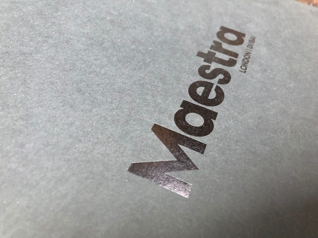

What is minimalist packaging?
When everything else on the shelf is unnecessarily complicated, pure simplicity stands out.
The absence of distracting graphics is the key feature of minimalist packaging design. It separates your products from the competition by conveying a concise and easy-to-understand brand message.
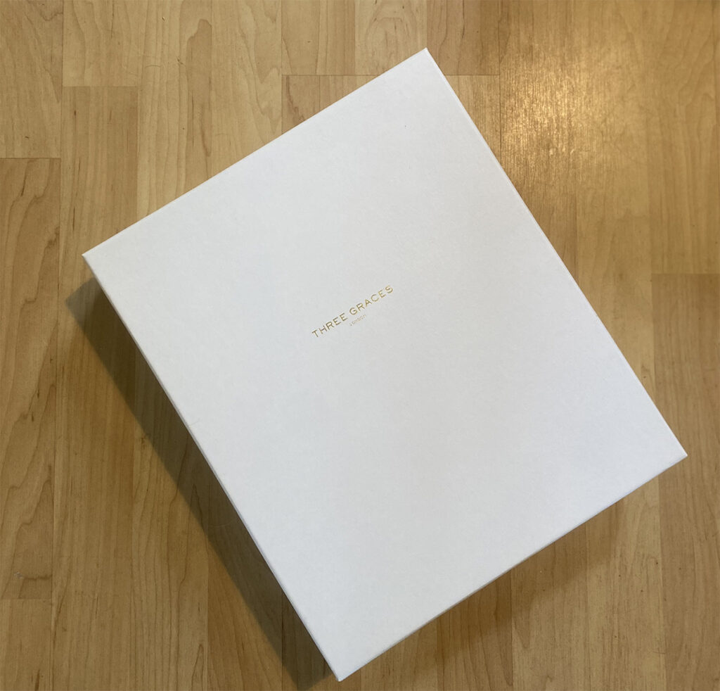


Minimalist design draws from limited colours, text, and fonts. Because of the simplicity of your marketing message, consumers can quickly recognise your products and make a purchasing decision.


What is maximalist packaging?
Go big or go home! Maximalism is all about impact and details. Vibrant colour, texture, rich motifs, bright typography, and visual or packaging innovations such as optical illusions or odd shapes are common in maximalist design.
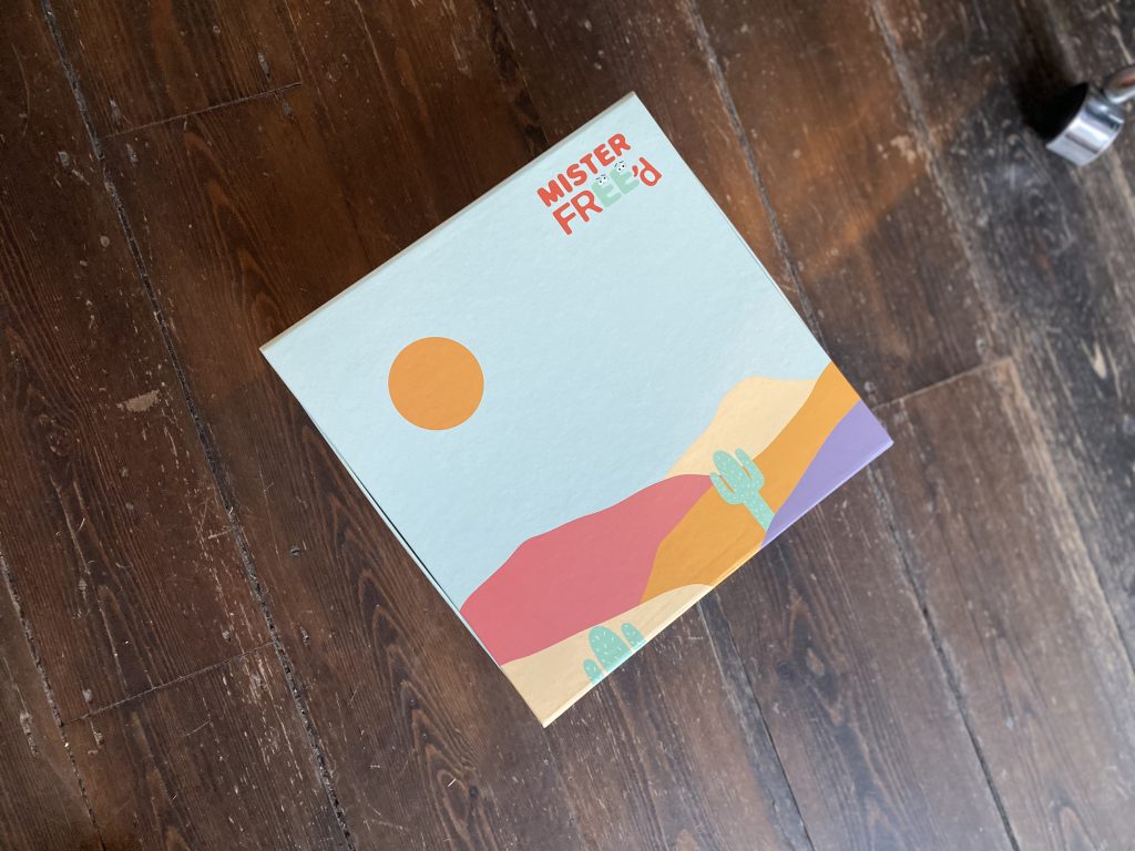


Maximalism appeals to the buyer through the brands’ individuality and appeals to their personality, lifestyle, and beliefs.
Which should you choose?
When it comes to highlighting the benefits of products, these two influential packaging styles allow firms to be bold, imaginative, and expressive.
You may still be undecided about which design is best for your product, so you may need to look deeper into what makes your product distinctive and how you can highlight that.
Reach out to one of our packaging experts to organise a design meeting if you need some further assistance making your selection, or get in touch for a custom quote if you’ve already made up your mind and are ready to begin your packaging journey.
Back to Blog