It’s rare that the colour blue is associated with positivity during the colder months, but we beg to differ! Blue is the most popular colour, which makes it a great choice for your product packaging.
Colour psychology suggests the colour blue conveys feelings of strength, honesty and dependability provoking thoughts of the sea, sky, and nature. Research has shown the shade of blue you choose can be important as it effects the message you are giving.
- Darker shades are seen as conservative, professional, and serious.
- Lighter shades are softer, serene, and more relaxed.
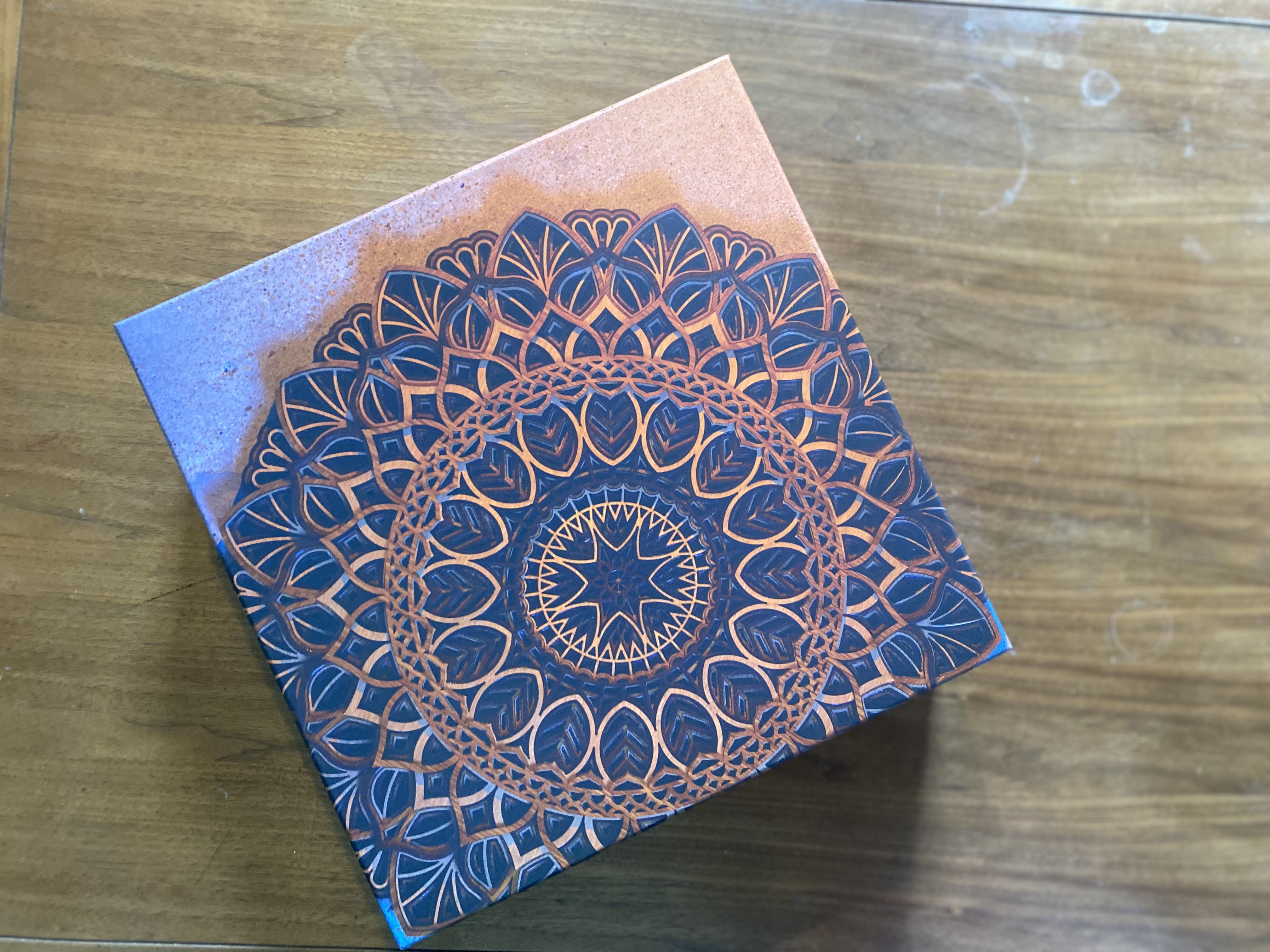
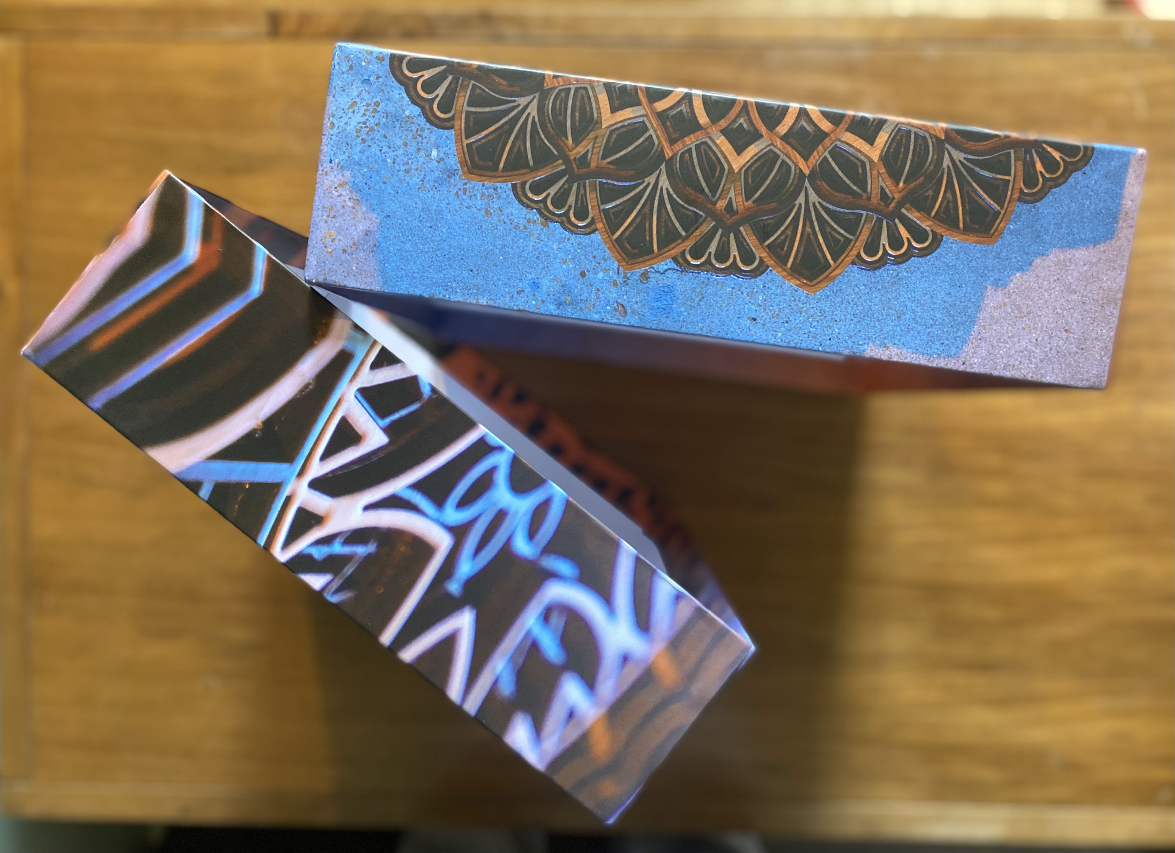
Tritonal Reverence LP
The relaxing qualities of the colour blue fit this beautiful bespoke LP box perfectly. The burnt orange Mandela design represents this meditation album perfectly and gives you a feeling of sun and sea.


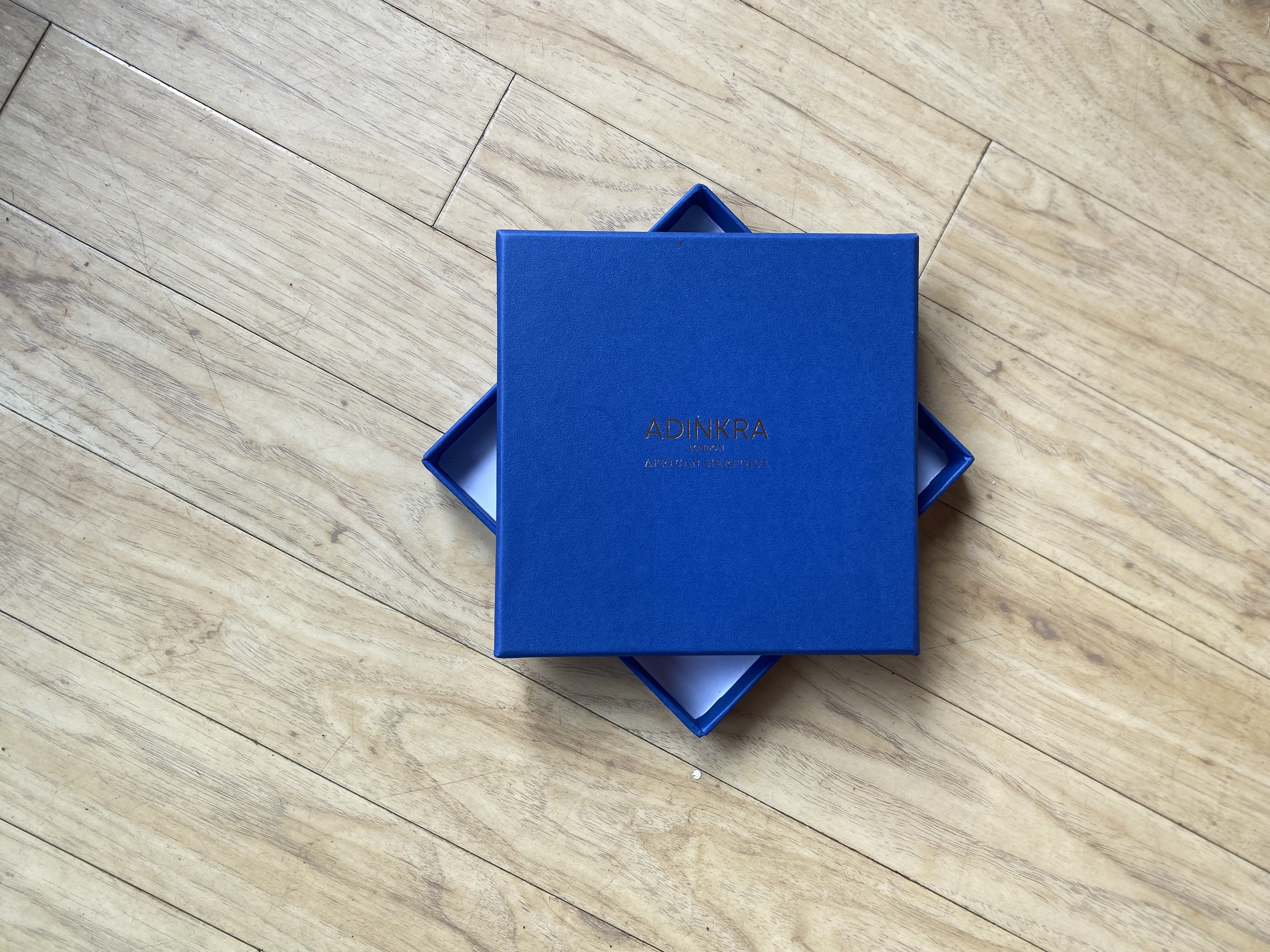
Adrinka London
Creating luxury African fashion accessories and ties, Adrinka describes their products as elegant and refined. The choice of a royal blue box featuring a gold foil-printed logo oozes style and sophistication.


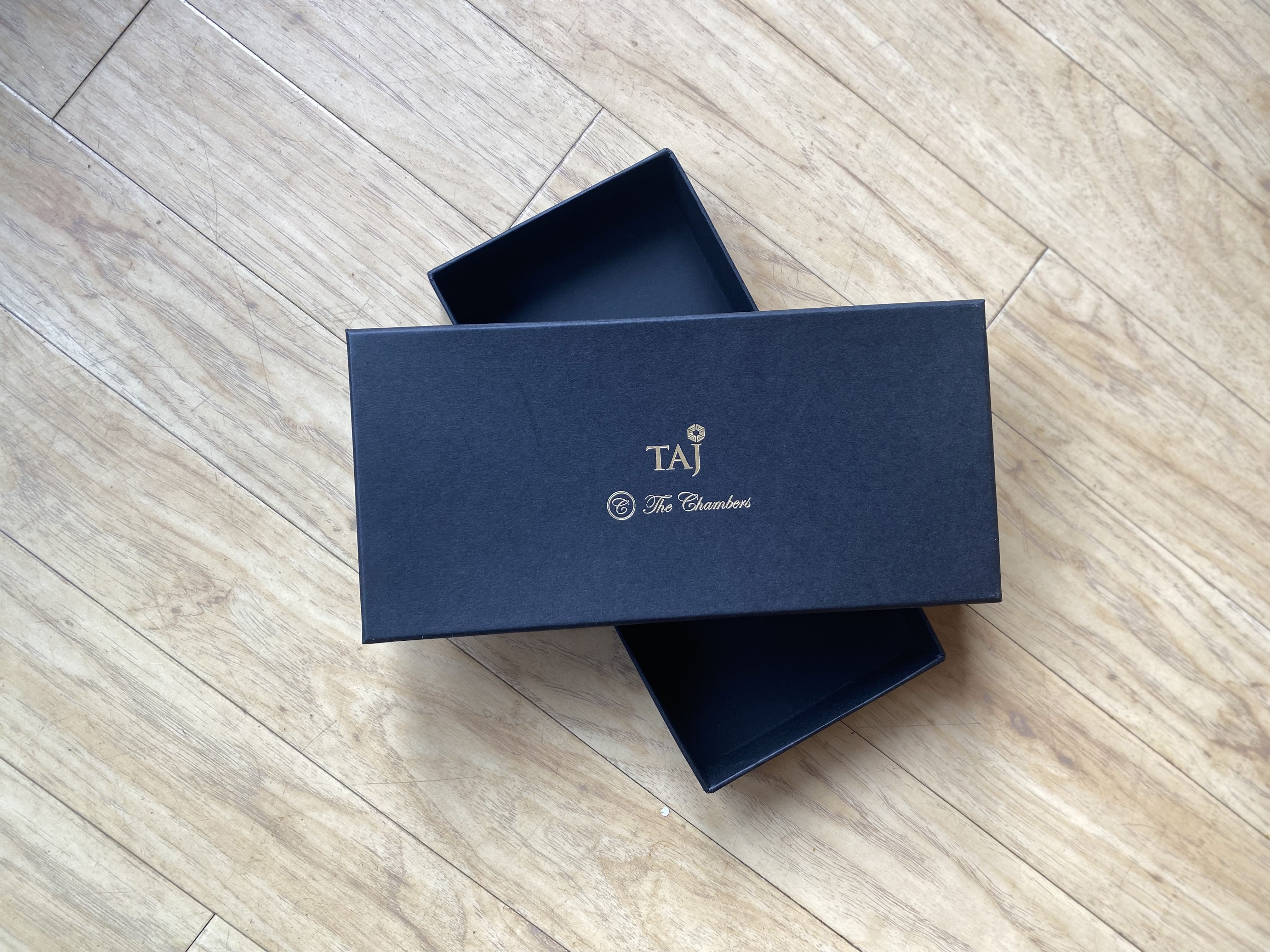
Taj @ The Chambers
Known as India’s very first exclusive business club, it’s no surprise Taj @ The Chambers chose a discreet, conservative navy blue bespoke box for their UK launch. The foil printing looks luxurious, high-quality and has you guessing what’s inside!


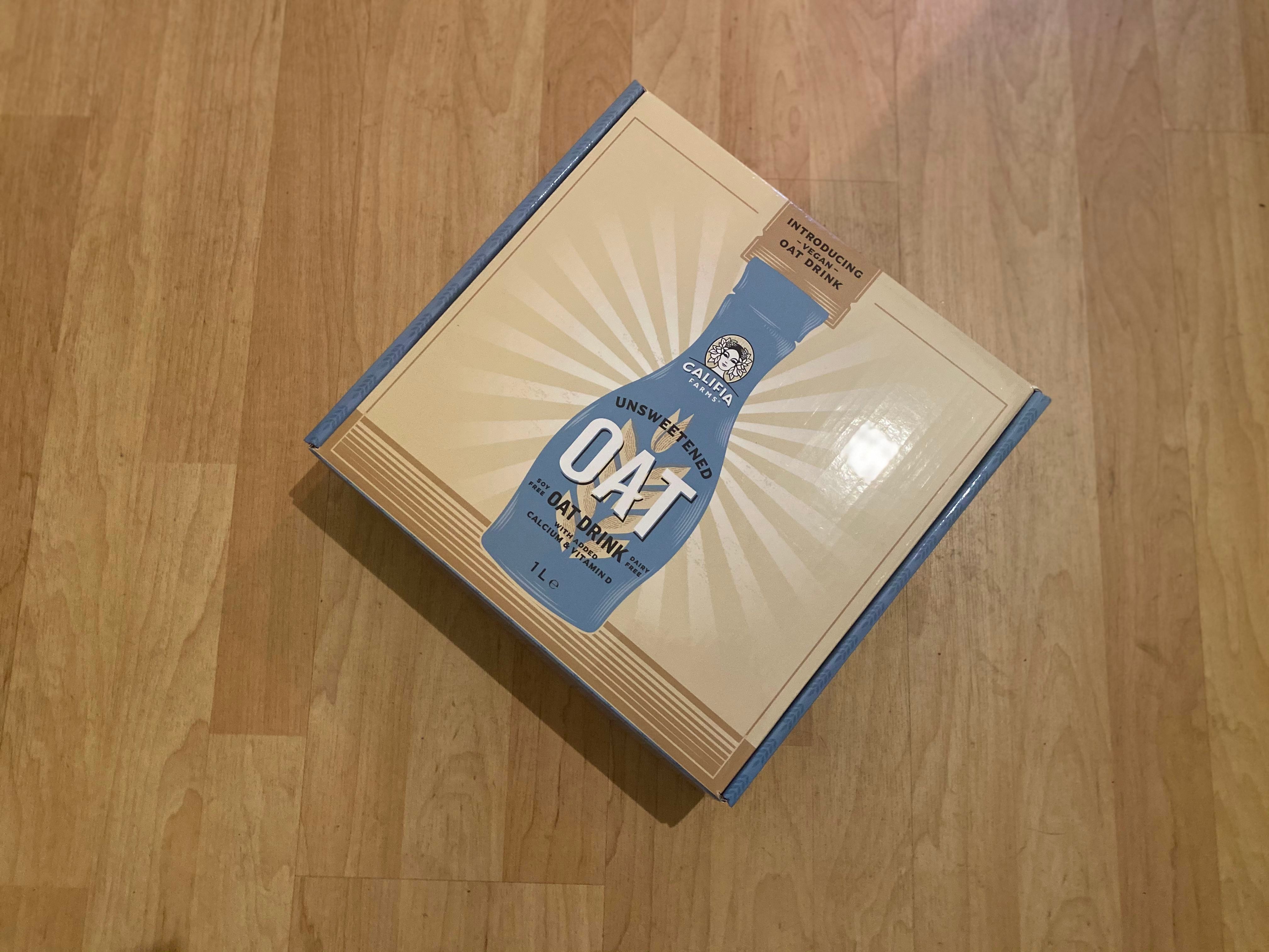
Califia Farms Unsweetened Oat Drink
You will recognise Califia Farms products from the milk section. With their promotional packaging they stuck to pastel blue branding, a firm favourite with the younger generations, who happen to be the biggest group of vegans.


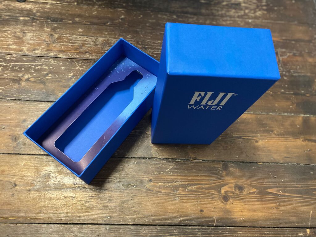
Fiji Water
A shade of blue as iconic as their marketing stunt at the Golden Globes in 2019, we’re still talking about it, and we instantly think of Fiji water when we see it.
